As a creative professional, I enjoy working with brands to bring their unique message to life. It's exciting to help shape the way brands are experienced and perceived by their customers. I enjoy the collaborative process of working with clients, as well as other creative professionals, to solve business problems from a creative perspective.
Logo Designs


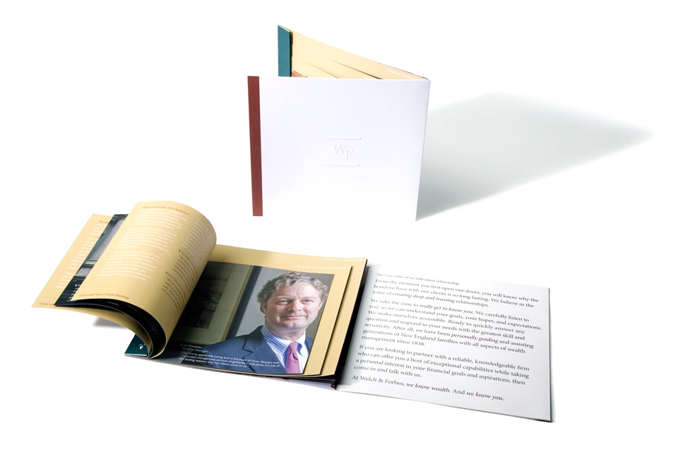
Welch & Forbes
Brochure design and Branding
Financial Services
Art Director - Bob Giordani
Writer - Russ Branscom
Photographer - Bill Gallery
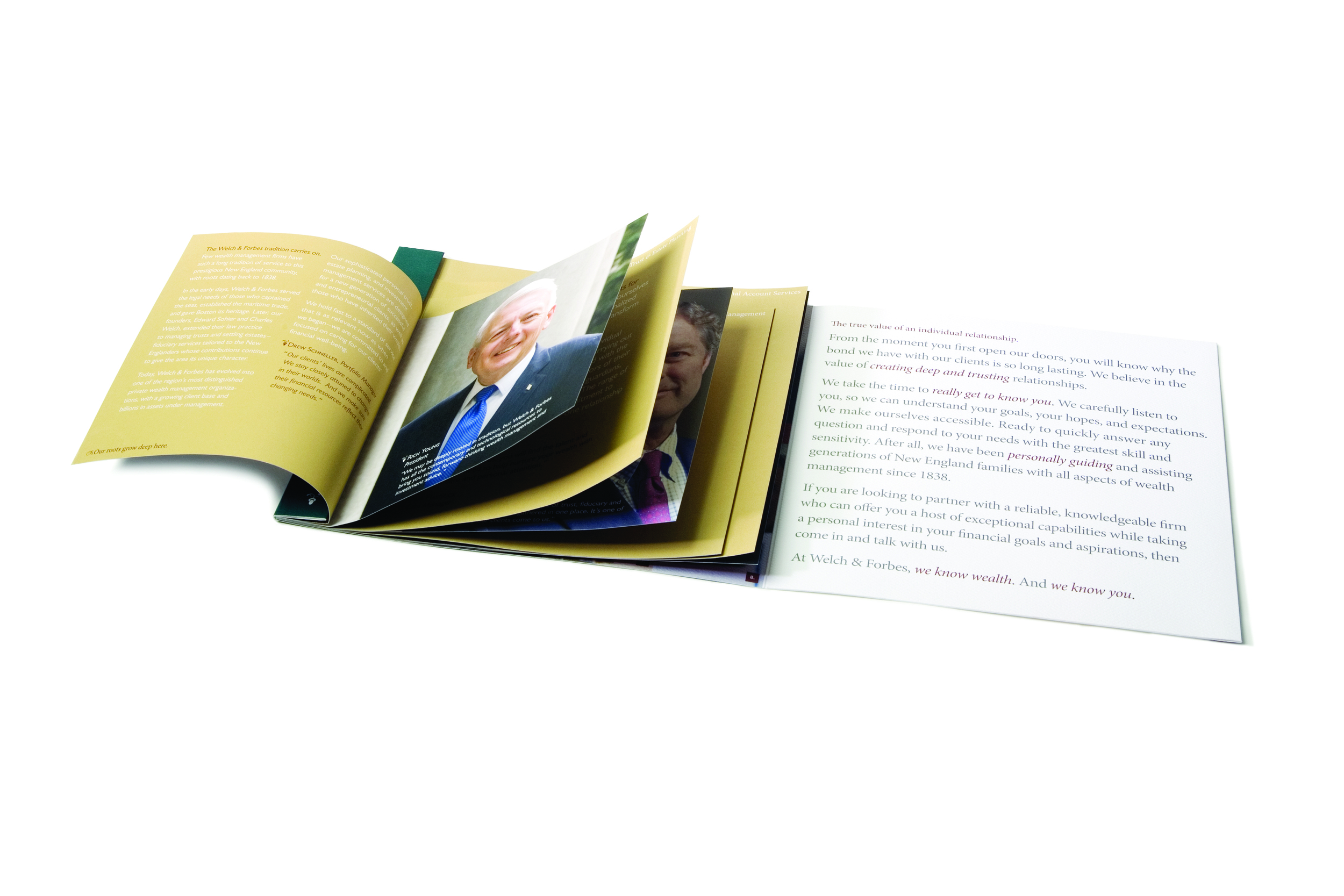
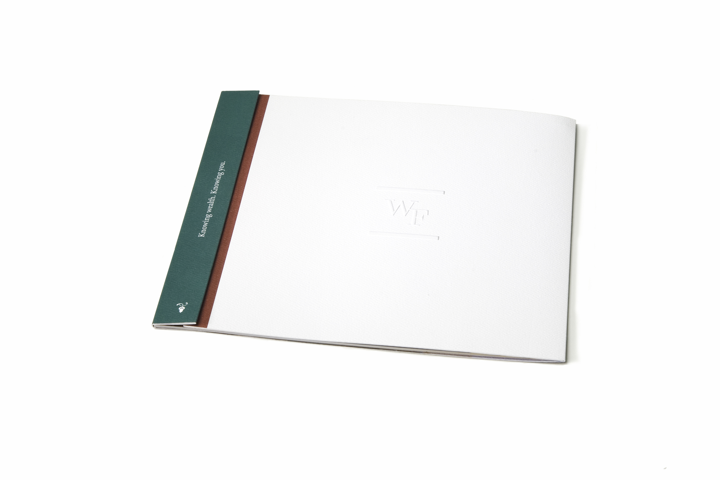
Welch & Forbes needed a brochure to communicate with prospective clients. While many businesses have transitioned to websites to achieve this broad communications goal, Welch & Forbes opted for a more personal printed piece capable of relating their corporate story in a sophisticated manner. They sought a visual standard that could be used across all of their marketing materials.
The book needed to contain a consistent brand story that detailed their history and experience in serving the wealthiest families in the Boston area and emphasized the relationship and connection between advisor and client. To meet these dual goals, the work showcased portraits of actual wealth advisors shot in their historic office space in Boston's Old City Hall. It was important that the visual aesthetic of the piece matched their brand persona.
In order to allow the book to grow with Welch & Forms and be utilized for multiple business purposes, I chose to make the inside pages interchangeable. Based on a clients profile and needs, an employee could put pages together from a larger collection to customize the message, while the Welch & Forbes mission remains visible on the inside cover throughout.

Glenmede
Custom Print Design
Financial Services
Art Director - Bob Giordani
Writer - Jonathan Krantz
Glenmede is an independent investment and wealth management firm based out of Philadelphia. I designed this direct mailer to facilitate the development of a more sophisticated visual aesthetic through which they could communicate their brand story.
As the recipient opens the mailer each panel reveals information which illustrates what Glenmede sees as its "unique position" within the wealth management industry. It was important to them that the images were inclusive, diverse, and relatable for their target demographic: baby boomers.


Junior Achievement NE
Custom Print Design
Non-Profit
Art Director - Bob Giordani
Photography - Junior Achievement
Writing - Junior Achievement
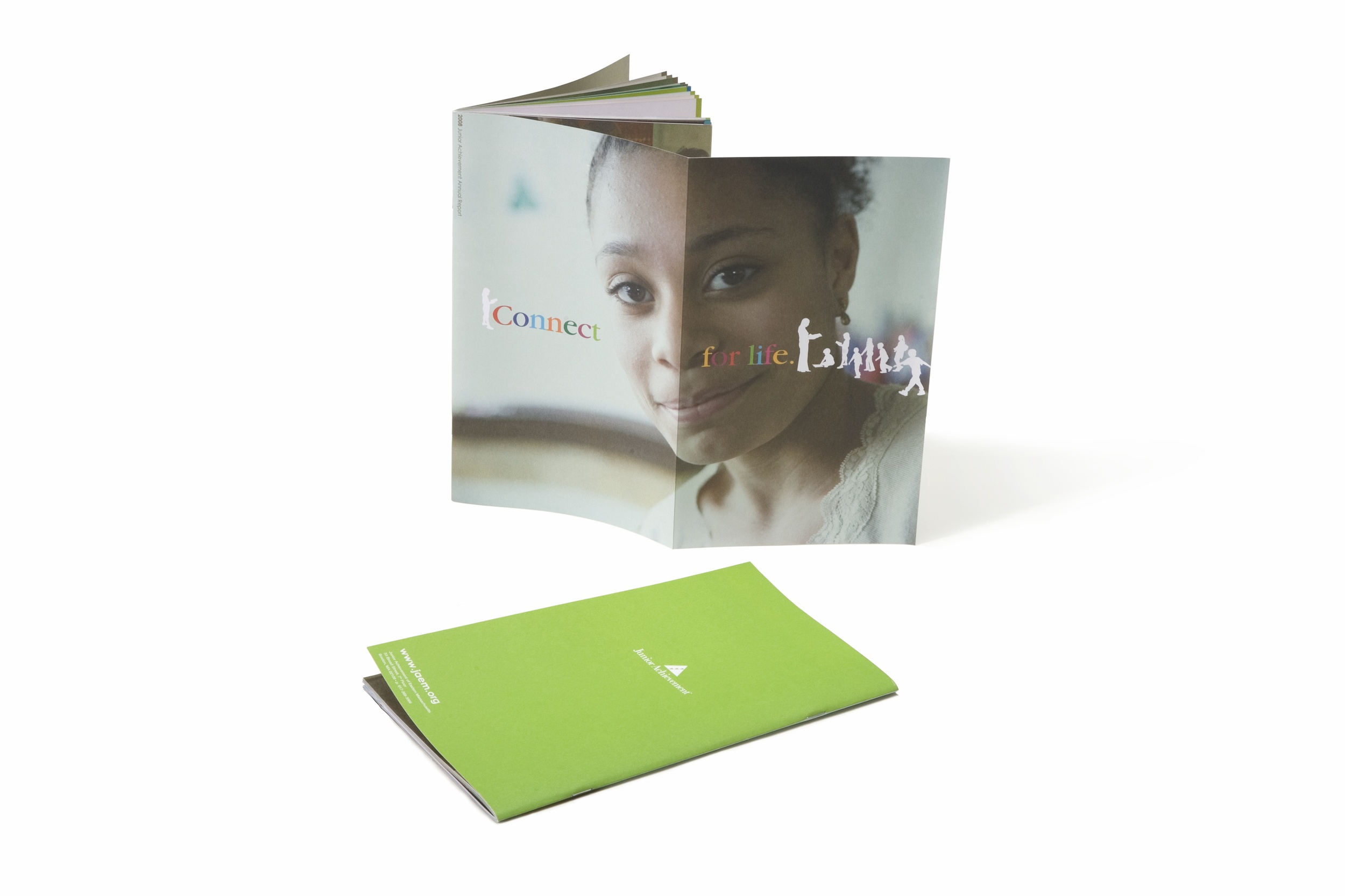
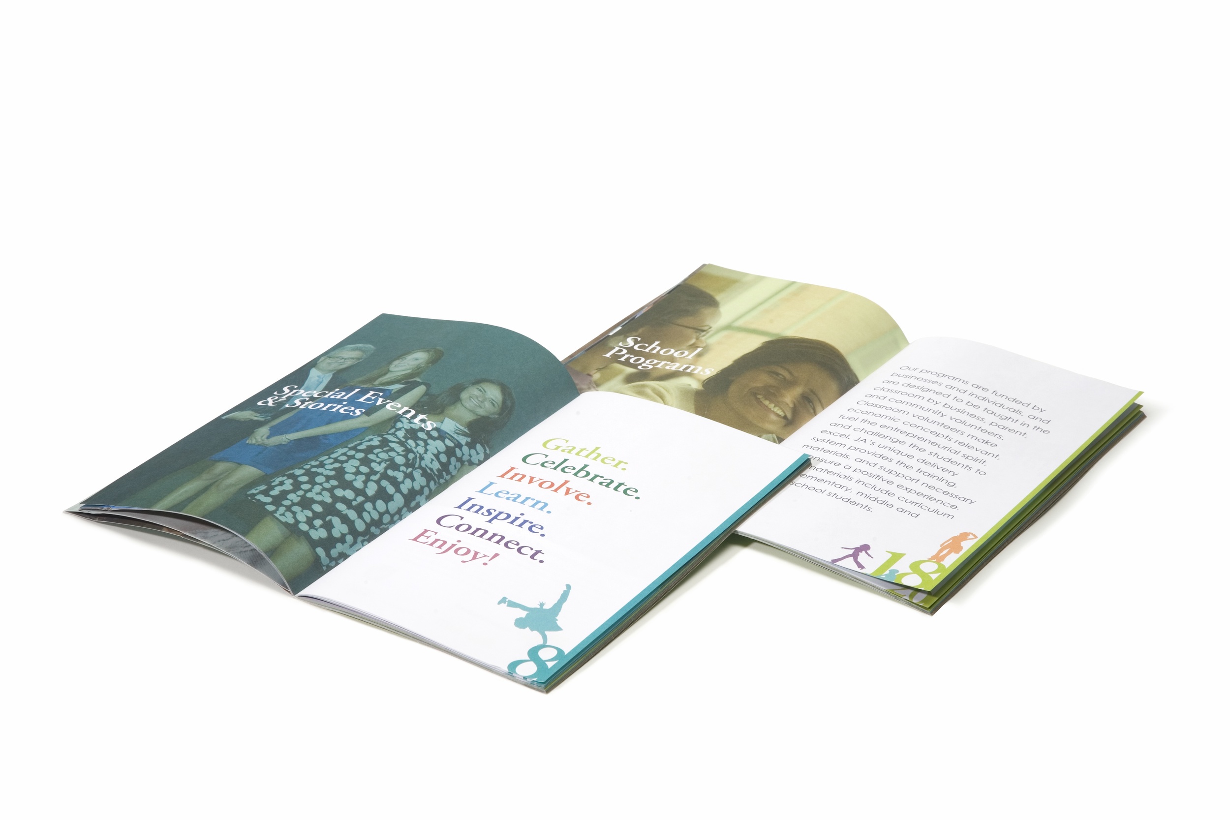
Junior Achievement New England is a national nonprofit whose mission is to educate youth about free enterprise, capitalism, and entrepreneurship. Junior Achievement requested an annual report designed within the brand standards of their organization. This annual report needed to display their financials and core capabilities as well as serve as a promotional marketing piece.
The report elaborated on all of their programs and events, so Junior Achievement could use the annual report throughout the year to publicize the organization's positive influence on the youth from participating communities. It was important to convey the message that today's students could be tomorrow's volunteers.

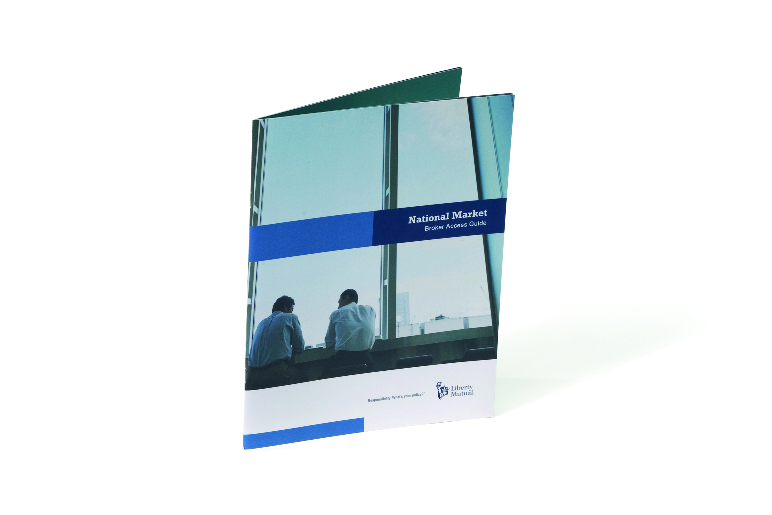
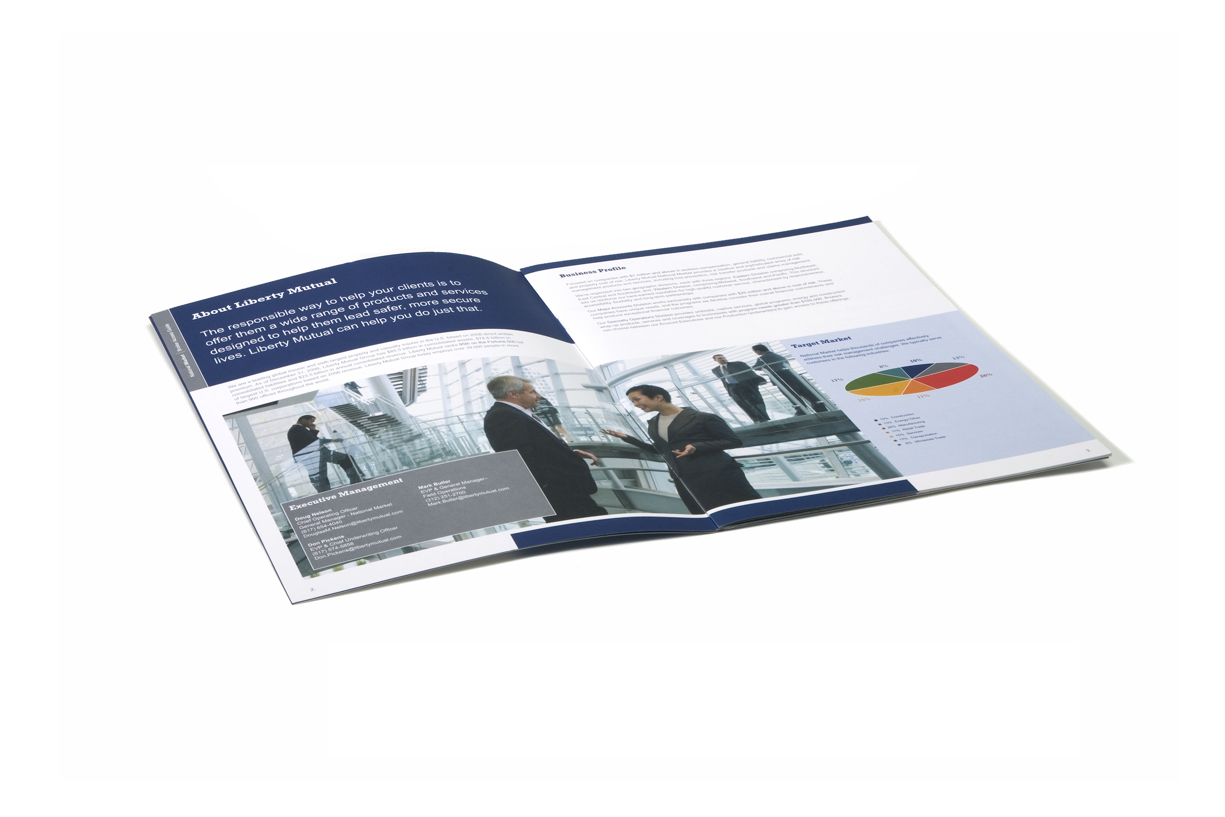
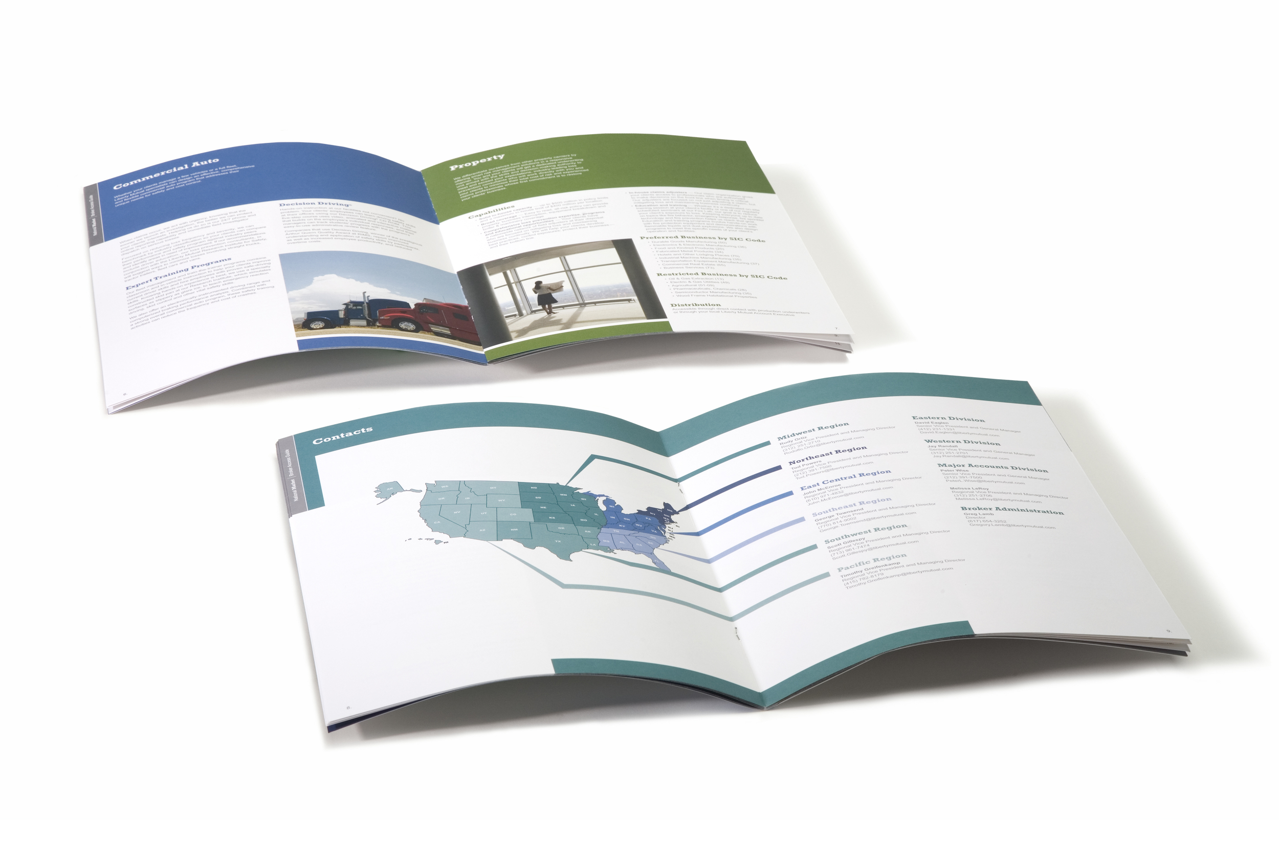
Liberty Mutual
Custom Print Design / Branding
Insurance
Liberty Mutual is an insurance company whose products are sold through insurance agents nationwide. This book was specifically designed as a communications piece for the agents associated with the National Markets branch of Liberty Mutual. They called it the broker access guide and it served to detail all the information that could be referenced by a broker on a sales call.
Working with large corporation like Liberty Mutual means that you need to adhere closely to their brand standards. This piece needed to work within a library of sales tools available to National Market Brokers.

BCCJ
Custom Print Design
Non-Profit
Working with non-profit organizations can often provide a design challenge: maximize impact and minimize cost. I worked with Boston Center for Community & Justice while at Trinity Communications to help them design custom print collateral such as event invitations, brochures, and program materials which communicated their unique mission.


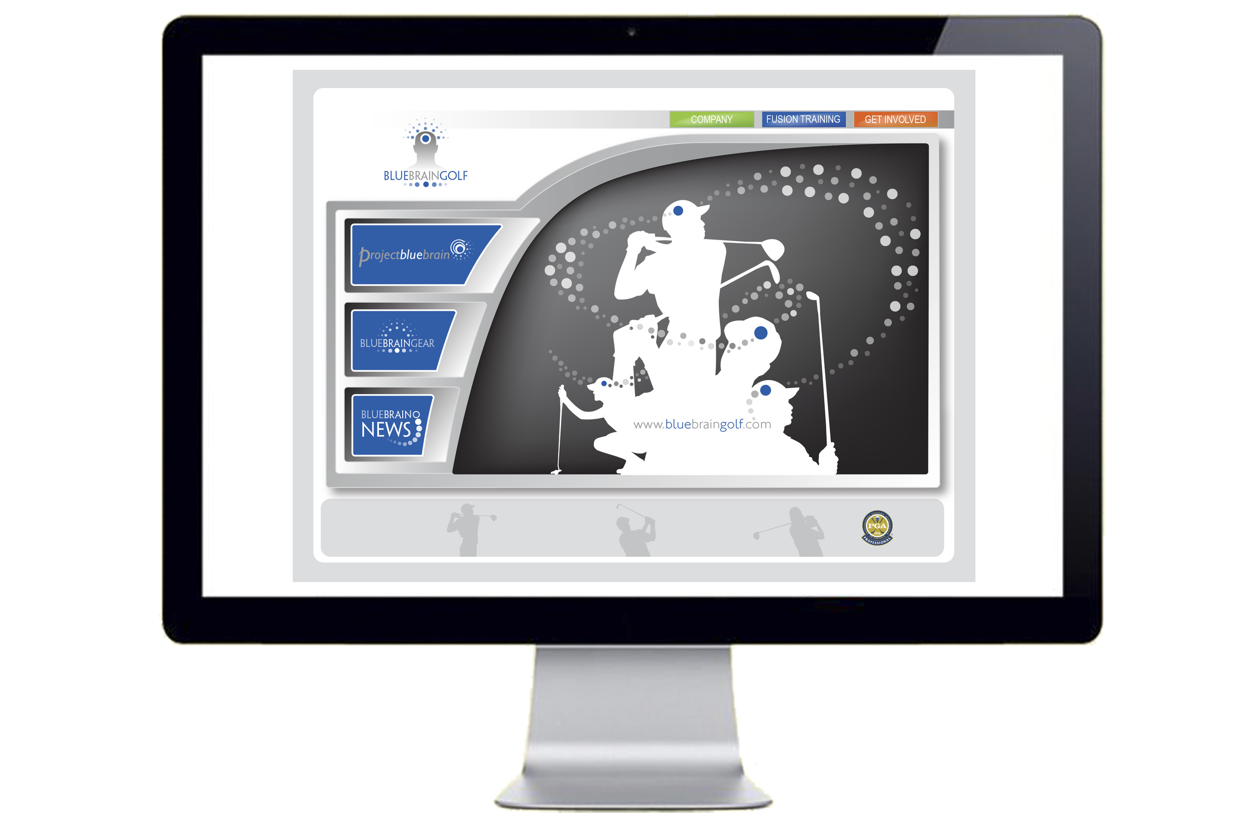
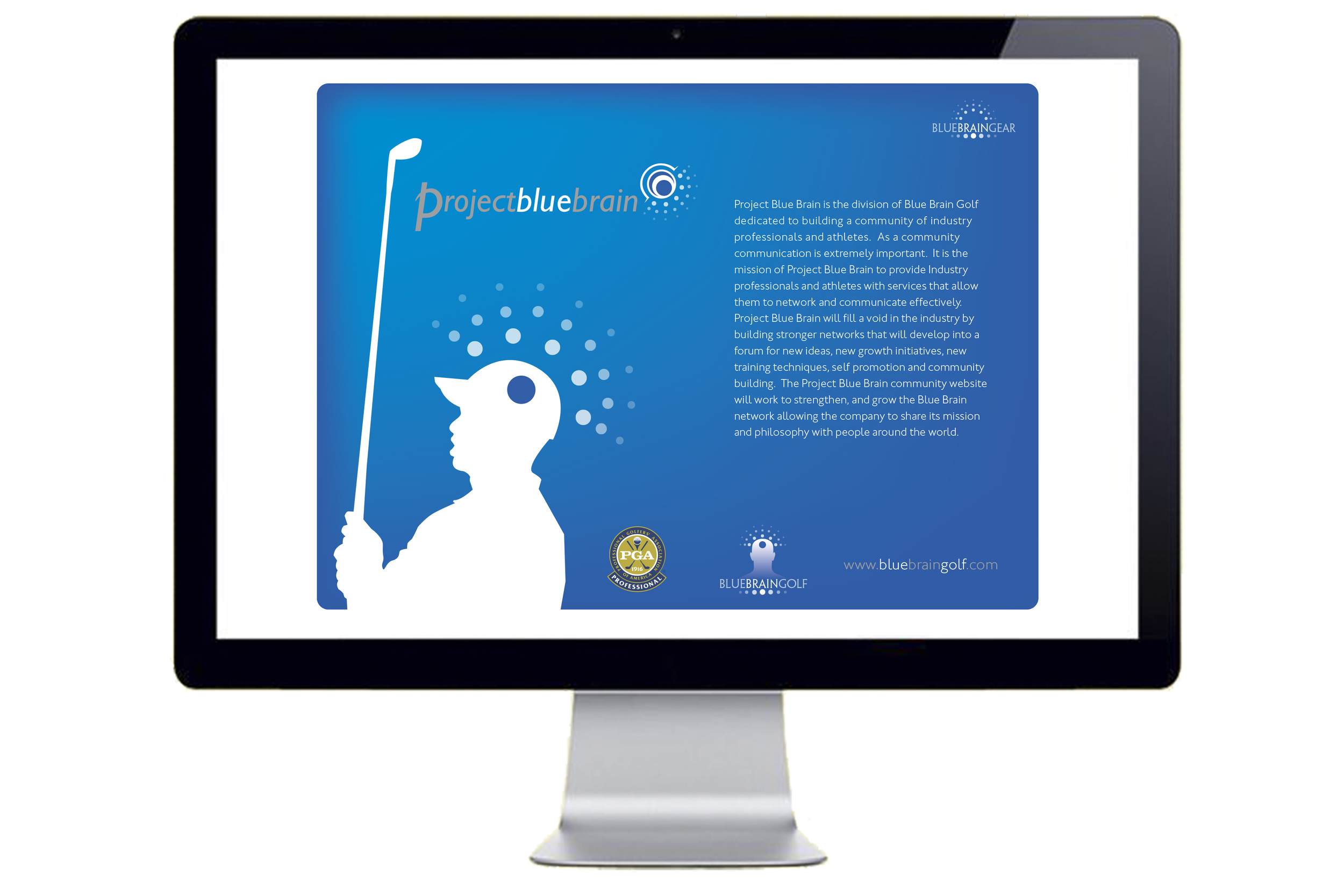
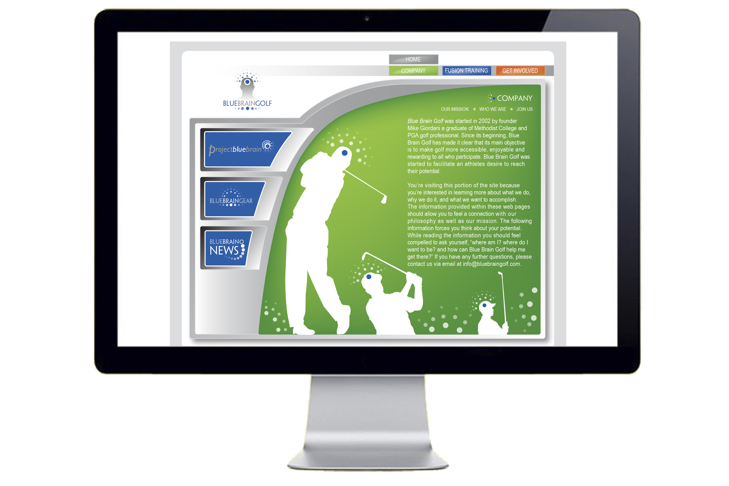
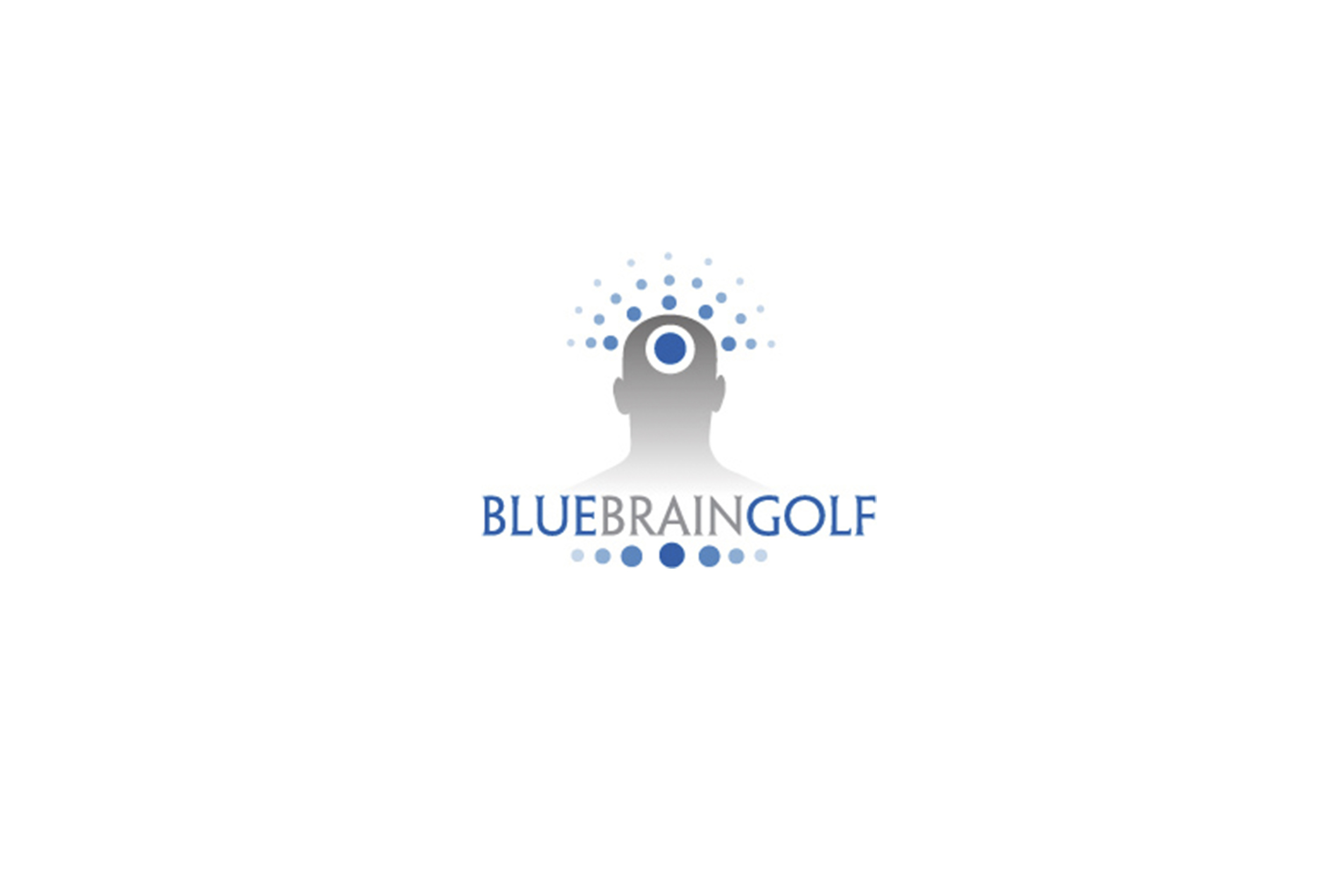
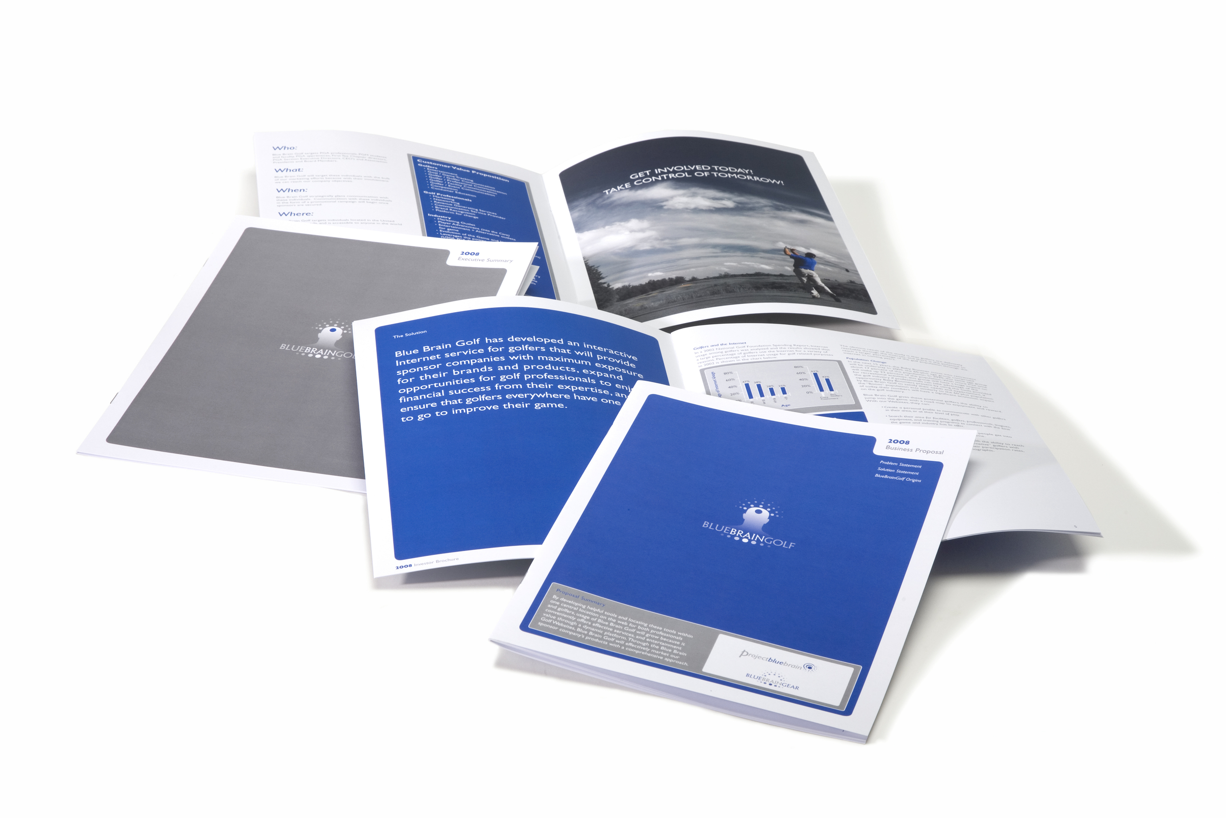
Blue Brain Golf
Custom Print / Web Design / Branding
Golf Instruction
In 2009, I worked to create a logo for an emerging golf instruction company, Blue Brain Golf. The design of the logo launched the process of branding the company and lead to the creation and design of a website and other print materials that could be used to approach potential investors and stimulate interest in company's new approach to golf instruction.
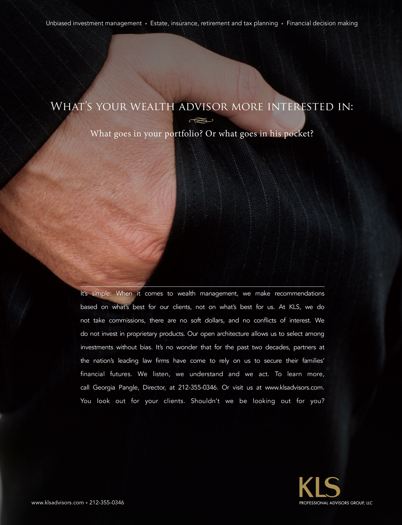
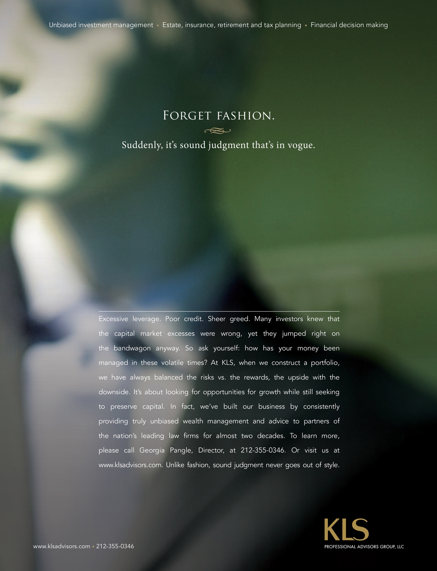
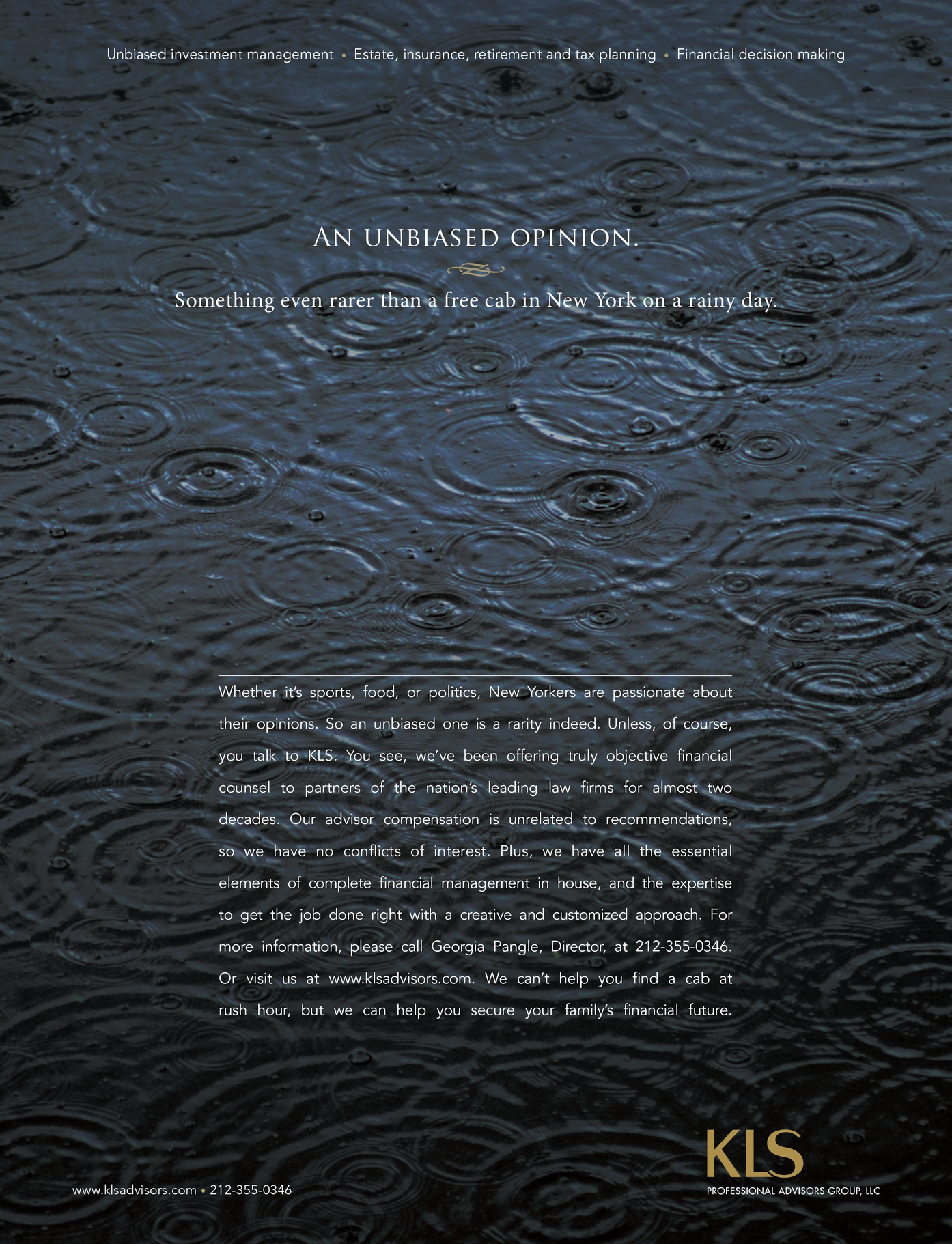
KLS Professional Advisors Group
Print Advertising Campaign
Wealth Management
Art Director - Bob Giordani
Creative Director / Writer - Jonathan Plazonja
KLS Professional Advisors Group was looking for a print advertising campaign which would run as a full page in American Lawyer magazine. The headline is bold and the copy suits with an assured tone and a sophisticated selection of typefaces and composition. The ads feel confident and capable which reflects KLS Professional Advisors Group's position within in the world of wealth advisement.

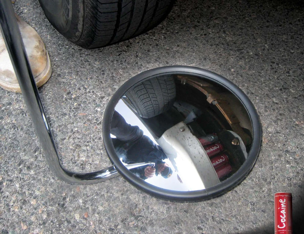
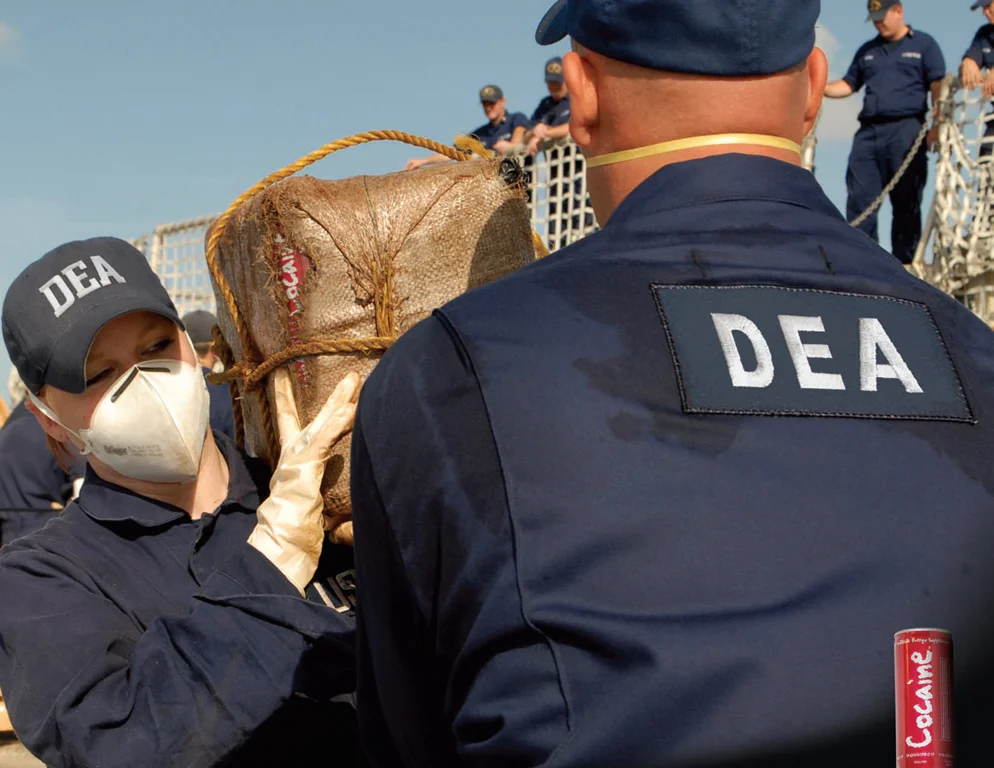
Cocaine Energy Drink
Spec Advertising Campaign
Art Director - Bob Giordani
Photography - Stock Photo
In 2008, I took a class at Arnold Worldwide to develop my art direction skills. Below is a series of spec print advertisements for Cocaine Energy Drink. Inspired by the drink's provocative name, I played with the idea of trafficking. This work was a merit award winner for a student advertising campaign at the 2009 Hatch Awards.

Childrens Gas X
Spec Ad / 2010
Art Director - Bob Giordani
Photography - Stock Photo
This image was inspired by an evening ride on Boston's Green Line. I noticed a mother and son sitting across from me who had just left a Red Sox game. The young boy was excited, playing with his new Sox hat. Suddenly, a horrible smell wafted past me, a familiar experience on public transportation. Looking back at the mother and son, it dawned on me that even cute children fart and I had the idea for this ad.

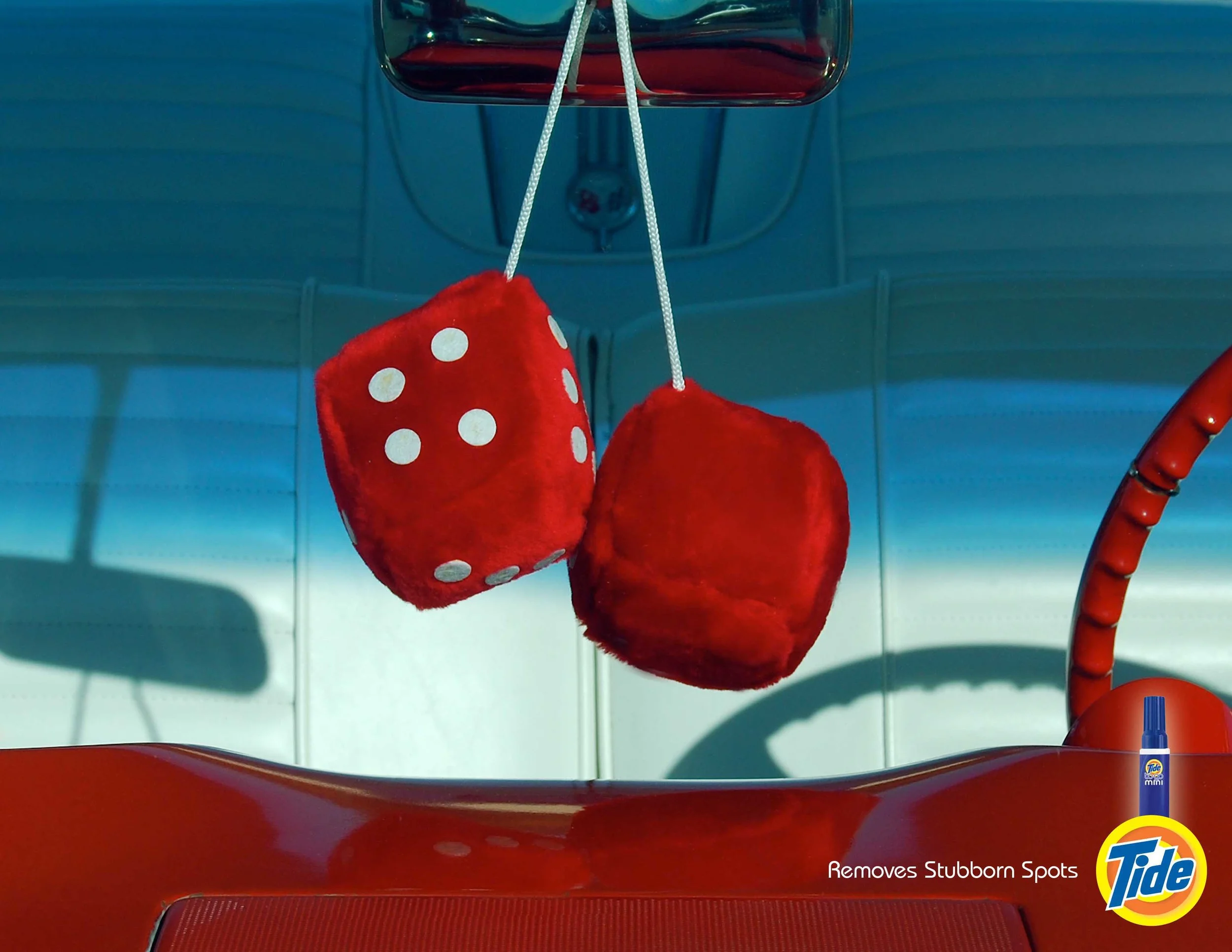
Tide To Go
Spec Ad 2010
Art Direction / Photoshop - Bob Giordani
Photography - Stock Photo


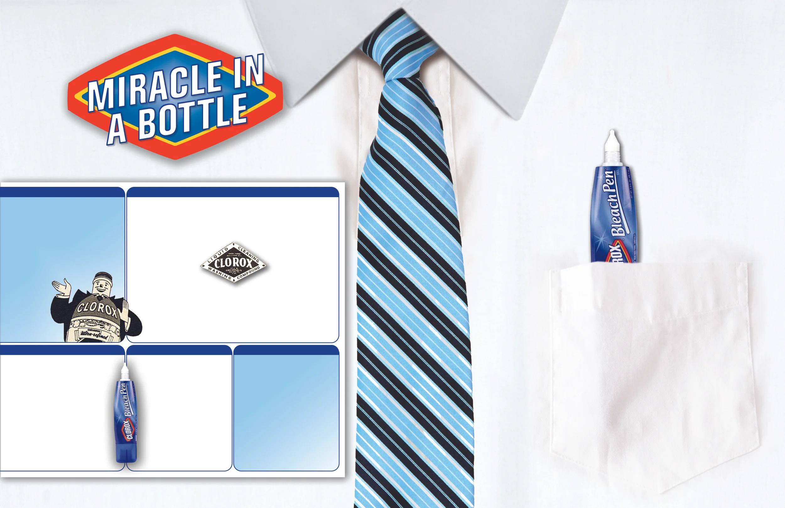
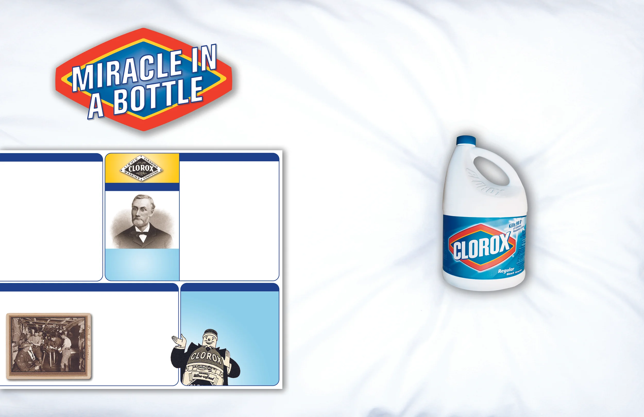
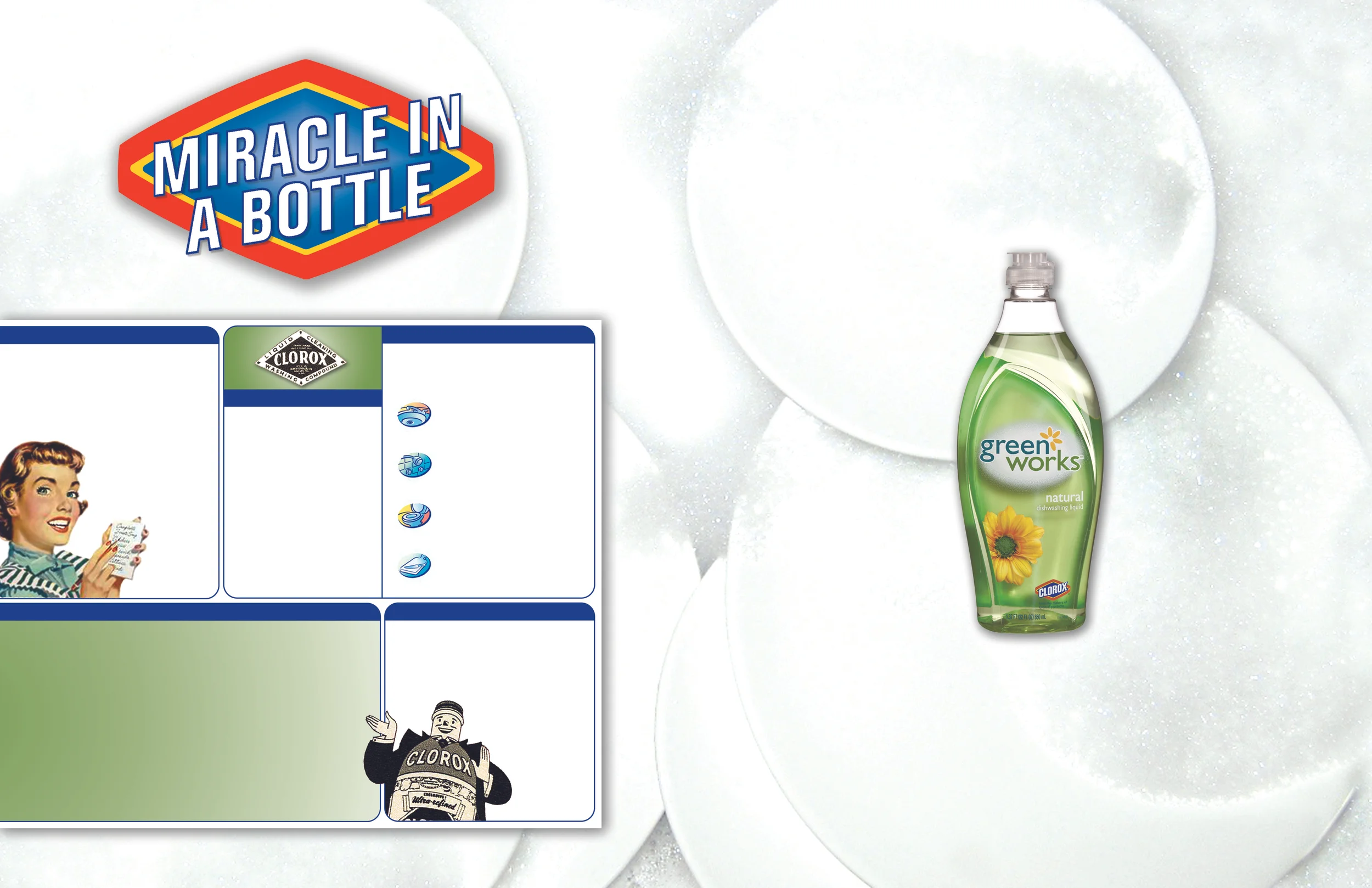
Clorox Spec Art Direction
Spec Ad 2011
Art Direction / Bob Giordani
Photography / Stock Photos
These were originally designed to be full spread magazine ads but I can see the elements being used in exterior billboards possibly seen in subways or along sidewalks. The design incorporates elements from the established Clorox brand look and feel. The product is featured on the right and on the left Clorox's history would be explained. I used the label from the back of a bleach bottle to design the cells on the left that would contain the ads copy.